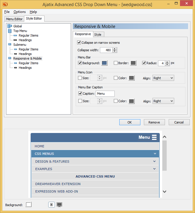
Editing Responsive Settings
Switch to the Responsive tab of the Responsive & Mobile panel to access Responsive settings.

Collapse on narrow screens
If set, the menu will collapse into a bar with a responsive menu icon on narrow screen devices, e.g. phones. Tapping the menu icon will reveal a slide-down menu.
Collapse width
Specifies the maximum window width at which the menu will be displayed in the narrow mode.
Background
Defines the background color of the menu in the narrow mode.
Border
Defines the color of border around the menu.
Radius
Specifies the corner radius.
Menu Icon: Size
Size of the menu symbol on the menu bar.
Menu Icon: Color
Color of the menu symbol.
Menu Icon: Align
Specifies the location of the menu symbol on the menu bar.
Caption
Specifies whether the text caption should appear on the collapsed bar, and if so, the text of the caption.
Menu Bar Caption: Size
Font size of the caption on the menu bar.
Menu Bar Caption: Color
Text color of the caption.
Menu Bar Caption: Align
Specifies the location of the caption on the menu bar.