Editing Thumbnails Style
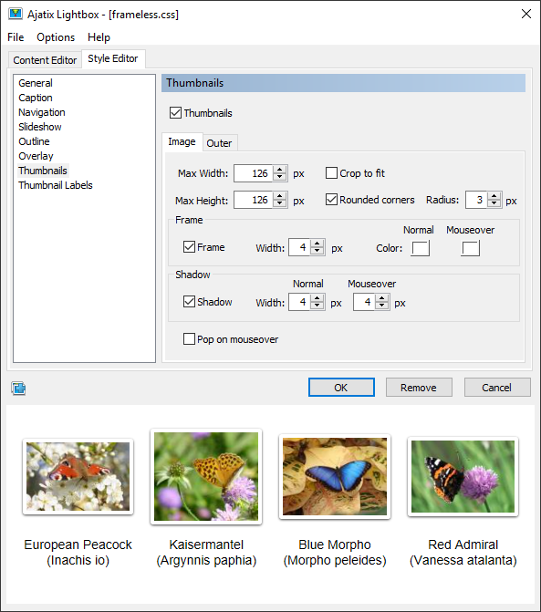
Select Thumbnails to access thumbnails style settings.

Thumbnails
When set, thumbnails are used to represent the images on a page. Otherwise plain text links are used.
Select Image tab to set image properties or select Outer tab to set outer box properties
Max Width and Max Height
Define maximum width and height of a thumbnail image.
Crop to fit
This option crops thumbnails to match the Max Width and Max Height dimensions exactly. Thumbnails will be cropped to ensure that the entire space is filled.
Rounded corners
When selected, corners of the thumbnails image will be rounded.
Radius
Defines the radius of rounded corners.
Frame
Turns on and off a frame outline around the thumbnails.
(Frame) Width
Specifies the frame width.
(Frame) Color
Specifies the color of the frame for normal and mouseover states.
Shadow
If set, the thumbnail will cast a shadow.
(Shadow) Width
Specifies the width of the shadow for normal and mouseover states..
Pop on mouseover
If set, the thumbnails will pop out (zoom in) on mouseover.

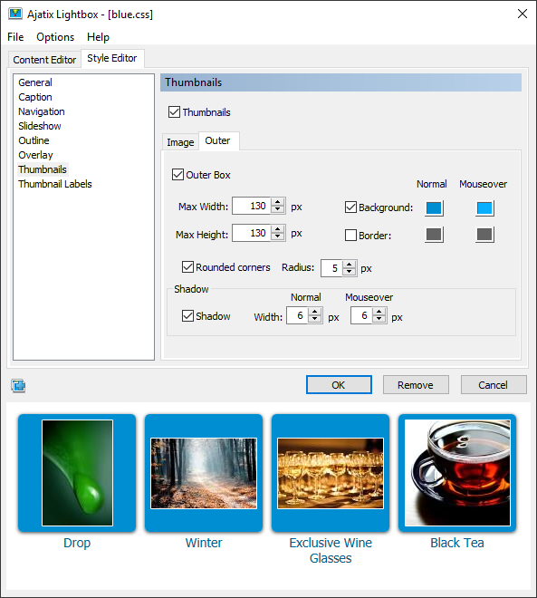
Outer Box
When set, a box will be drawn around a thumbnail.
Max Width and Max Height
Define the outer box size.
Background
Sets the outer box color for normal and mouseover states.
(Outer Box) Border
Sets the outer box border color for normal and mouseover states.
Rounded corners
When selected, corners of the outer box will be rounded.
Radius
Defines the radius of rounded corners.
Shadow
If set, the outer box will cast a shadow.
(Shadow) Width
Specifies the width of the shadow for normal and mouseover states.